
Web Design for B2B SaaS
Learn about the web design creation for B2B SaaS. Create a site that generates leads and allows you to establish partnerships.

You’ve invested months developing your product, perfected its core functionality, and perhaps even secured your first paying users. Yet, a visitor lands on your site and leaves within ten seconds. That’s pretty disheartening, isn’t it?
Here’s the reality: your website acts as your primary salesperson, your 24/7 product demo, and frequently your one chance to make a strong impression. If your B2B SaaS site is unclear, sluggish, or lacks distinction, you’re missing out on significant revenue—potentially a huge amount.
You might be thinking, “We’re not in the business of selling sneakers, so we don’t need anything flashy.” That’s understandable—but remember, good design is about clarity. Enabling a time-strapped operations manager to immediately understand how your solution saves them 20 hours each month? That’s user experience at its best.
Truthfully, many founders swing between two extremes: over-engineering their site (“Should we add animations? Custom micro-interactions?”) or under-prioritizing it (“Let’s just throw up some text and a button”). The ideal approach lies comfortably in the middle—and it’s far more straightforward than you might assume.
In this piece, I’ll break down the essential elements of high-converting B2B SaaS website design. You’ll find actionable advice, practical guidelines, and pitfalls to steer clear of.
Why Most B2B SaaS Websites Fail to Convert Qualified Leads
Traffic is flowing. Paid ads are performing. SEO efforts are finally bearing fruit. Sounds promising—except your sales pipeline remains empty.
You’re seeing plenty of visitors, but few—if any—qualified leads. Worse still, you’re booking demos with people who clearly fall outside your ideal customer profile (ICP). They drain your sales team’s time and vanish after the initial call. Meanwhile, the real decision-makers breeze by without a second glance.
Chances are, the issue isn’t your product—it’s your messaging. Your website might be speaking to the wrong audience or using language that’s too abstract. B2B buyers aren’t casually window-shopping; they’re under pressure, pressed for time, and scanning for immediate evidence that you truly grasp their challenges. If that clarity isn’t there within the first five seconds, they’ve already moved on.
Too often, SaaS websites are designed with the internal team in mind—not the actual buyers. The result? Pages crammed with feature dumps, generic claims like “streamline your workflow,” and vague calls to action such as “Get Started.” What visitors actually need is something specific and outcome-driven: “See how teams reduce onboarding time by 40%.”
That’s why a conversion-optimized website doesn’t just influence lead quality—it directly impacts your revenue path and even long-term retention. When your site sets unclear or inflated expectations, churn can begin before a customer even logs in for the first time.
UX Strategies That Drive More Qualified Demo Requests
What you really need isn’t just more demo clicks—it’s the right people clicking “Book a demo.” And their evaluation begins the moment they land on your page, long before they ever see your call to action.
High-performing B2B SaaS websites that consistently generate qualified demo requests share a few key traits: they minimize friction, establish immediate relevance, and gently steer visitors toward the most appropriate next step.
Speak Directly to Your ICP—Right at the Top
When someone from your ideal customer profile (ICP) arrives on your homepage, they should feel instantly understood—not surveilled, but recognized. Think less “We know who you are” and more “This was built with people like you in mind.”
Ditch vague headlines like “Powerful workflow automation for modern teams.” Who exactly are “modern teams”? Instead, be precise: “Help HR operations leaders cut onboarding time in half—no engineering team required.” That’s role-specific, outcome-driven, and speaks directly to a real pain point.
Take Mantis, for example. Their messaging includes lines like “Connected camera solutions for all vehicle types” and “Multi-camera systems. Any vehicle. Any industry.” A fleet manager searching for telematics immediately gets it—no endless scrolling or guesswork required.
Remember: the space above the fold is prime real estate for attention—and in B2B, attention is fleeting. You have just 3–5 seconds to signal, “You’re in the right place.” Waste that window on buzzwords or internal lingo, and you’ve already missed your chance.
Use Intent-Driven CTAs—Not Generic Ones
“Contact Us” is a conversion dead end. It offers zero clarity, makes no promise, and dumps all the cognitive load onto the visitor.
Instead, tailor your CTA to where the user likely is in their buying journey. Early-stage explorers? Offer a quick product walkthrough or a use-case guide. Mid-funnel evaluators comparing vendors? Invite them to a personalized demo. Ready to commit but unsure about pricing? Send them to a clear, transparent pricing page with optional add-ons.
And don’t push enterprise buyers into free trials if your product demands setup, training, or integration—that feels like a bait-and-switch. They’ll leave. But offering a focused 15-minute session with a solutions expert? That shows you respect their time.
Even without dynamic personalization, smarter static CTAs work wonders. “See how logistics teams use [Product] to reduce delivery errors by 30%” outperforms “Get Started” every time—because it’s contextual and outcome-oriented.
Reveal Complexity Gradually
Your product may be highly technical—but your homepage shouldn’t read like a developer manual.
Early visitors don’t need details about webhooks, granular permissions, or compliance certifications upfront. What they need is a compelling reason to care. Save the deep technical specs for dedicated pages—pricing, security, and integrations—where genuinely interested users will go when they’re ready.
Think of it like a conversation: you don’t open with your full resume. You start with shared challenges. Similarly, hook visitors with simple, results-focused messaging first, then unveil deeper layers as their interest grows.
And if you’re trying to optimize without direction, keep this in mind: true conversion rate optimization (CRO) begins with foundational web design. Tweaking button colors might help marginally, but if your landing page doesn’t mirror how B2B buyers actually think and behave, you’re just rearranging deck chairs on the Titanic.
UX Tactics That Boost Trial Sign-Ups and Drive Activation
Clarify What’s Ahead—Before They Sign Up
Before a visitor even enters their email, they should clearly understand what the trial entails—and whether it’s truly relevant to them.
Too many SaaS sites simply shout, “Start your 14-day free trial!” with no context. But a finance operations manager at a 200-person company has vastly different needs than a solo founder testing an idea. If your product requires CRM integration, team provisioning, or domain verification, concealing those details until after sign-up only breeds confusion, frustration, and unnecessary support requests.
Instead, use the pre-signup screen as a strategic moment to both qualify and inform. A concise message like:
“Designed for revenue teams using Salesforce. Connect your CRM in under 5 minutes and generate your first forecast within 24 hours.”
This does three critical things:
- Filters out mismatched users who won’t benefit
- Defines a clear early win (“see your first forecast”)
- Reassures qualified users they’ve landed in the right place
Streamline the Trial Onboarding Flow
Every additional field in your sign-up form silently erodes conversions. Do you genuinely need job title, company size, industry, and phone number just to begin a trial—or are you disguising data collection as “personalization”?
In B2B, some information is necessary—but gather it progressively. Start with just an email. If role affects onboarding, ask for it next. Defer the rest (like company details or use case) until activation or day two.
Avoid multi-step modals that feel like bureaucratic paperwork. And if you must require a credit card upfront, be transparent: “We ask for a card to prevent abuse—no charges until day 15.” Honesty builds trust. That said, unless you’re targeting enterprise buyers, asking for payment info too early will significantly lower conversion rates.
Remember: the trial sign-up experience is often the user’s first real touchpoint with your product. If it feels slow, cluttered, or confusing, they’ll assume the entire platform is the same—even if it isn’t. Effective SaaS conversion design ensures the right users start their journey primed for success.
Build Trust Through Credible, Relevant Signals
Choosing a new vendor always carries risk—especially when the website looks hastily assembled. Even if your technology is superior, a low-effort design makes prospects question your professionalism, not your code.
In B2B SaaS, design functions as trust infrastructure—communicating reliability, expertise, and market fit without a single word of copy.
Social Proof That Resonates With Your Buyer
Displaying customer logos is easy—but rarely persuasive. What actually influences decisions is social proof tailored to the reader’s role and priorities.
A CFO doesn’t care that “[Big Brand] uses your tool.” They want to know: “[Big Brand] cut SaaS spend by 32% last quarter.” An engineering lead cares less about being “trusted by innovators” and more about native integrations with their existing stack.
Go beyond logo grids. Use case studies that reflect your buyer’s reality: same sector, comparable team scale, and familiar challenges. Even better? Name names:
“How Maria Chen, Director of RevOps at TechFlow, slashed onboarding from 2 weeks to 48 hours.”
And when sharing metrics, favor specificity over fluff. “99.9% uptime” is expected. But “87% of customers achieve full adoption within 60 days, with measurable ROI in under 45” feels tangible and credible.
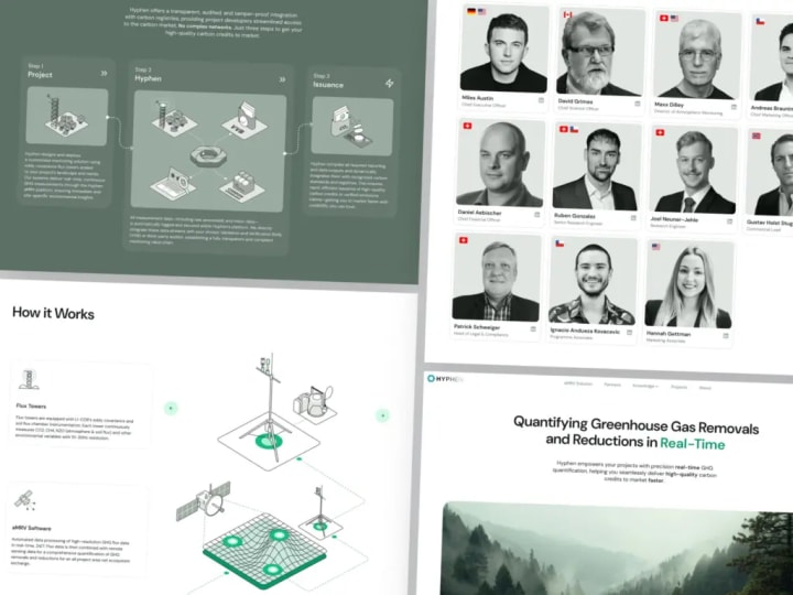
We put this approach into practice while crafting UX patterns for Hyphen. Their site features animated walkthroughs that visually explain how the solution works, the steps involved, and key outcomes—backed by concrete stats like “reducing instrumentation costs by over 80%.” This blend of clarity, relevance, and proof turns skepticism into confidence.
Frequent B2B SaaS Website Design Pitfalls
Trying to Speak to Everyone—and Resonating With No One
It’s a common trap: your landing page attempts to appeal to both mid-market operations teams and enterprise security leaders, so you craft messaging that straddles the fence. The outcome? A bland headline like “Secure, scalable solutions for modern businesses.”
It feels safe—but it rarely converts.
The core issue is forcing vastly different buyer personas through the same front door. A bank compliance officer and a growth marketer at a Series B startup have entirely different goals, pain points, and decision criteria. When your copy is diluted to “fit all,” it ends up connecting with none.
A smarter strategy: either build distinct landing experiences (even if through dynamic content or segmented paths) or lead boldly with your primary ICP—then place secondary audiences deeper in the site. In B2B, clarity always trumps comprehensiveness.
CTA Overload Without Direction
Have you ever landed on a B2B homepage and felt bombarded? “Book a demo!” “Start free trial!” “Talk to sales!” “Download the guide!” “Watch the video!” “Join our webinar!” It’s like stepping into a store where five staff members shout competing offers the moment you walk in.
B2B buyers are already juggling complex decisions. Don’t add cognitive load by making them figure out what to do next. For effective SaaS trial UX, choose one clear, primary action per page—aligned with user intent. On a pricing page? Your CTA should likely be “Start trial” or “Contact sales.” Guide visitors toward the right next step—not just any next step.
Prioritizing Aesthetics Over Funnel Function
This mistake often comes from good intentions. You want your site to feel polished, cutting-edge, and distinctive—so you invest in custom animations, micro-interactions, and cinematic hero sections.
But if those design elements don’t actively support your conversion funnel—if they slow load times, drown out key messages, or break mobile usability—they’re doing more harm than good. Flashy visuals can unintentionally undermine trust and performance.
In B2B SaaS, great web design isn’t about spectacle—it’s about reducing friction, reinforcing credibility, and guiding qualified visitors forward with quiet efficiency. Sometimes, the most impactful design decision is stripping away the noise so your value proposition can finally cut through.
Final Insight: In B2B SaaS, UX Directly Shapes Pipeline Quality
Your user experience doesn’t just influence how people perceive your product—it determines who even decides to engage with you in the first place.
Exceptional design makes your ideal buyers feel instantly seen and understood. It lowers the cognitive barrier to saying “yes” and subtly filters out poor-fit visitors before they consume your sales team’s time.
Design That Converts Starts With Empathy for the Buyer
When your homepage speaks plainly to a RevOps manager’s real-world challenges—using concrete outcomes instead of vague promises—you attract higher-quality demos. These prospects arrive already aligned with your solution, ask more informed questions, and move through the funnel faster.
Why? Because your site acts like a mirror—clearly reflecting their priorities, pain points, and goals. The result? Shorter sales cycles, stronger trial-to-paid conversion rates, and reduced churn.
In this light, UX isn’t just about aesthetics or usability—it’s a force multiplier for revenue. Every optimization—faster load times, clearer language, and CTAs matched to buyer intent—adds up to measurable business impact.
So if you’re still viewing B2B SaaS web design as optional polish or a one-off project, you’re missing a critical growth lever. The truth is, your website isn’t just a digital brochure—it’s your most scalable sales and qualification engine.
About the Creator
Shakuro
We are a web and mobile design and development agency. Making websites and apps, creating brand identities, and launching startups.
Critical Update
Apple’s software updates often arrive quietly, but every now and then, one lands with unusual importance. iOS 26.3 is shaping up to be exactly that kind of release. While it may look like a routine point update on paper, industry watchers, including Bloomberg’s Mark Gurman, suggest this version carries far more weight than its number implies.
By Active USA about 22 hours ago in 01


Comments
There are no comments for this story
Be the first to respond and start the conversation.