Website Redesign During Rebranding
How to redesign websites during rebranding? Discover tips and tricks to connect the elements.
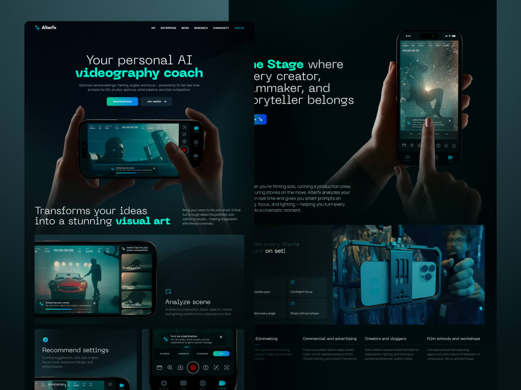
The logo feels new, the color scheme is finalized, and there's palpable excitement around the updated brand voice—until you notice the website still screams 2019. In an instant, what began as an exciting rebrand starts to feel like a user experience disaster.
Countless startups invest months—and significant resources—into redesigning their websites as part of a rebrand, only to see bounce rates climb and conversions stall. The reason? They approached the site like a static advertisement rather than a dynamic dialogue with users. Sure, it looks refreshed—but does it still serve the people who actually use it?
Rebranding isn’t about starting from scratch; it’s about evolving your narrative while staying recognizable to your audience. That balance is tricky: lean too hard into bold visuals, and you risk eroding trust; play it overly cautious, and the whole effort feels underwhelming.
Whether you’re deep in the trenches of rebranding your website’s user experience or just beginning to consider it, this guide is for you. We’ll unpack the common pitfalls, highlight what truly drives results, and show you how to sidestep that gut-wrenching moment when your stunning new site leaves loyal customers scratching their heads.
Why Rebrand-Driven Website Redesigns Often Miss the Mark
A rebrand can feel like a clean slate—but without clear boundaries, that enthusiasm can quickly derail a website overhaul. Teams obsess over typography, animated transitions, and trendy gradients, only to discover they’ve inadvertently sabotaged core parts of the user journey.
These missteps rarely stem from poor design sense or lack of effort. More often, they result from conflicting goals, hurried timelines, and the dangerous assumption that “users will adapt.” Typical culprits include:
Putting style ahead of usability
A polished interface is impressive—until visitors can’t locate your pricing or your contact form disappears behind flashy animations. In the quest to stand out visually, teams sometimes overlook the value of consistency. Users develop mental shortcuts for navigating your site; disrupt those without warning, and you’ll face a surge in frustrated support requests and abandoned sign-ups.
Viewing the site as a marketing brochure instead of a functional product
Your website often doubles as your primary sales channel, onboarding assistant, and help desk—all in one. Yet during rebrands, marketing frequently takes the reins while product and customer support are left out of the loop. If your CMO hasn’t aligned with your CX lead or engineering team before finalizing the site architecture, you’re already heading for trouble.
Overlooking how real users actually behave
If most trial sign-ups originate from a footer button, don’t hide it in a minimalist hamburger menu “for aesthetics.” Too many redesigns reflect internal preferences rather than user habits. Tools like heatmaps, session replays, and good old A/B testing keep your decisions grounded in reality.
Underestimating user resistance to change
Maybe the old logo was outdated, and that purple-to-orange gradient wasn’t everyone’s favorite—but longtime customers associate those elements with dependability. A complete visual overhaul can feel jarring, like showing up to your neighborhood café only to find it transformed into a futuristic smoothie bar.
Weak collaboration between brand and development teams
When brand guidelines aren’t translated into precise, actionable instructions for developers, the outcome is inconsistency, broken UI components, and mobile layouts that seem haphazard. A successful rebrand sharpens your message—not muddles it. And your website? That’s where your brand promise either lands—or falls flat.
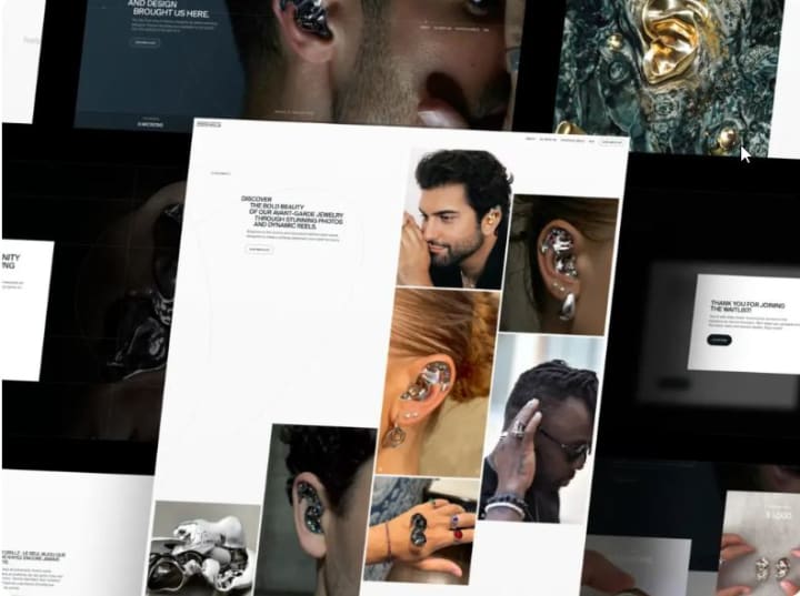
How to Reduce UX Pitfalls When Rebranding
If you’re moving forward with a rebrand, your website is likely due for an upgrade too. But before you share mood boards with designers or start sketching out hero banners, there’s essential groundwork to lay—work that prevents frustration, confusion, and user drop-off later on. And it begins well before any visual changes take shape.
Begin with Thorough User Research
User research often gets pushed aside as a “fix-it-later” task—but skipping it means you’re building on guesswork.
Examine current user behavior: Where do people abandon the flow? What words do they use when reaching out for help? Which features are non-negotiable in their daily use? Even better: talk to them directly. Just a few short conversations with your most engaged users can uncover more insight than weeks of internal speculation.
Don’t rely on assumptions about what’s working. Validate it. Ask questions. Observe actions. Redesigning without this understanding is like remodeling a home while the residents are inside—and you’re wearing a blindfold.
Establish Specific, Actionable Brand Guidelines
Phrases like “make it pop” or “feel more premium” aren’t useful direction—they’re placeholders for clarity. Yet teams waste valuable time because brand guidance is either too vague, contradictory, or limited to a logo file and a color code.
Effective website redesigns depend on detailed guidelines that go beyond palette and typography. They should clarify:
- How the brand communicates in interface text (Is “Whoops!” acceptable, or do we default to formal error messages?)
- Our stance on layout density (Do we favor open, serene spacing or a tightly packed, action-driven layout?)
- The personality of interactions (Should buttons respond with energy or restraint? Playfulness or professionalism?)
Equip both designers and developers with a shared reference document—complete with clear dos and don’ts—so even late-night tweaks stay true to the vision.
Map Core User Journeys and Maintain Continuity
It’s easy to obsess over individual screens while losing sight of how they connect. But users experience your site as a sequence—not a collection of pages. If that sequence shifts abruptly during a rebrand, they’ll disengage.
Before touching the design, map out critical paths: account creation, onboarding, purchasing, accessing support. Then evaluate:
- Does the new layout streamline these flows—or add unnecessary steps?
- Are essential actions still easy to find when users need them?
- Do feedback moments (like success confirmations or error alerts) align with the updated brand tone?
A proven tactic? Run a side-by-side walkthrough of old and new flows from the perspective of a cautious, unfamiliar user. Would you get lost? Would you question whether you’re still using the same product?
Remember: consistency isn’t about visual uniformity—it’s about creating a reliable, predictable environment. Users don’t expect every screen to look the same; they expect to feel like they’re still in the same trustworthy place, even as it evolves.
Ultimately, a successful rebrand paired with a website redesign isn’t measured by how different it looks—but by how smoothly your users navigate the transition. Do the legwork upfront, keep real people at the center, and treat your website as the dynamic, living interface it truly is.
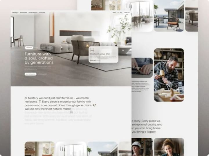
Using UX to Connect Rebranding with Business Growth
Rebranding is rarely just a cosmetic refresh—it’s usually part of a larger strategic shift, whether that’s breaking into a new market, appealing to a different audience, or moving beyond your initial user base. But if your website redesign doesn’t actively reinforce that strategic pivot, your new message won’t land. At best, it gets lost in the noise; at worst, it alienates the very customers you’re trying to grow with.
The solution? Treat UX not as an afterthought, but as a growth engine that amplifies your rebrand. Every interaction—scrolls, clicks, even subtle animations—should reflect your updated vision and contribute to tangible business results. Here’s how to do it without sacrificing authenticity or performance.
Anchor Your Brand Positioning in Real User Needs
A rebrand rooted only in internal ambitions, without regard for what users genuinely value, will feel empty. Your website is where abstract brand ideas must become human-centered experiences.
For instance, if you’re evolving from “an affordable tool for freelancers” to “a robust platform for mid-sized teams,” your messaging must shift accordingly. A headline like “Start free in 30 seconds” no longer resonates. Instead, your homepage should address concerns like enterprise security, team provisioning, or compliance—issues that matter to your new target audience.
At Shakuro, we embed user insights directly into the brand story. Rather than asking only, “What do we want to communicate?” we focus on, “What does our ideal customer need to hear right now to trust that we’ve evolved to meet their needs?” This approach yields messaging that feels both innovative and grounded—because it’s built on real challenges, not assumptions.
Take our work on the Select website redesign: we struck a balance between fresh aesthetics and familiar patterns. The visual identity aligned with the new brand direction, yet retained enough continuity to keep existing users comfortable—no jarring disruptions, no confusion.
Your site should embody your brand’s new values. If “clarity” or “empowerment” are now central to your identity, that should show up in intuitive navigation, upfront pricing, or in-context guidance—not just in mission statements.
Design for Conversion—Without Compromising the Rebrand
Let’s be honest: no one cares how stunning your new color gradient is if they can’t find the demo button. A rebrand offers a golden opportunity to fix hidden conversion barriers—but only if design and growth goals are integrated from the start.
That means baking conversion best practices into your visual and interaction design early on. Consider:
- Trust elements: Client logos, security certifications, or testimonials should feel like natural parts of the new design—not tacked-on afterthoughts.
- Clear calls to action: Primary buttons and sign-up flows must stand out visually in a way that matches your brand’s personality—bold and energetic for a disruptive player, refined and understated for a premium service—but never buried under “clean” minimalism.
- Purposeful microcopy: Language should echo your brand voice while reducing friction. “Begin your journey” may sound elegant, but “Start your free trial” often performs better—unless your data proves otherwise.
And don’t stop at the first conversion. Think long-term. Onboarding emails, dashboard cues, and even error messages should carry the same tone and clarity as your redesigned site. This continuity builds recognition, which fuels retention. Sometimes, the smallest UX adjustments—when aligned with brand intent—can have an outsized impact on revenue.
Ultimately, a rebrand-driven website overhaul shouldn’t feel like a rupture—it should feel like a thoughtful evolution. Your site is the bridge between your past and your future, and your users cross it every day. Make sure it’s stable, intuitive, and clearly pointing toward where you’re headed next.
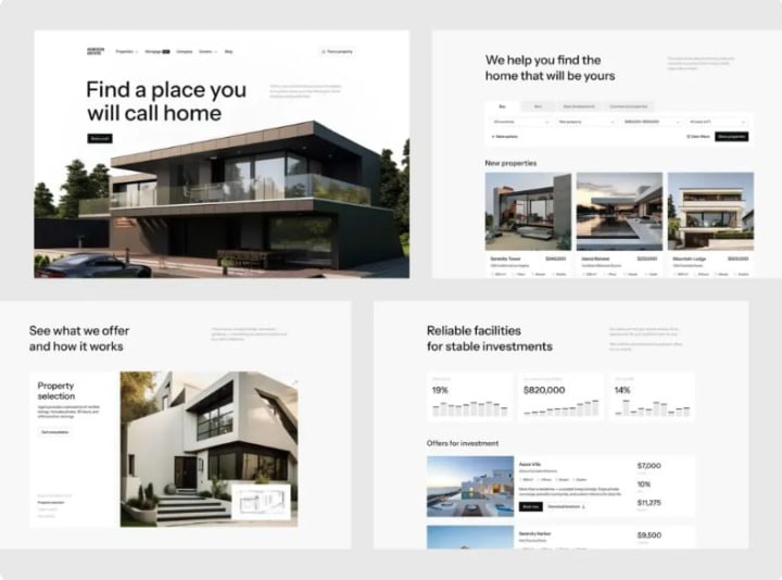
How to Keep Users Oriented During a Rebrand
Change—even positive change—is tough. Your users might say they’re ready for a modern look, but if they log in one day and can’t locate their account settings or discover their go-to button has disappeared into a hidden menu, frustration will follow quickly.
The real aim of a rebrand isn’t just to look different—it’s to show users you’re growing alongside them, not leaving them behind. So how do you introduce a new identity without making loyal customers feel like they’ve accidentally landed on a competitor’s site?
Preserve Core UX Patterns for Continuity
Not every element needs a complete overhaul. In fact, sometimes the best design decision is to keep things exactly where users expect them—especially when it comes to essential tasks.
Ask: What are the top 3–5 actions people take on your platform? Signing up? Uploading files? Reviewing performance data? If those flows already work smoothly, don’t redesign them just to match a new aesthetic (like swapping sharp corners for rounded ones). Instead, evolve them: maintain the same placement, sequence, and logic, but wrap them in your updated visual style.
Too often, teams chase “minimalism” by tucking primary navigation into hamburger menus in the name of mobile-first design—only to disorient a user base that primarily uses desktop. The result? Confusion and lost productivity.
The solution? Roll out changes gradually. During a phased launch, keep the original navigation for existing users while monitoring behavior. Only replace it once you’ve confirmed the new version doesn’t hinder task completion.
Remember: familiarity breeds trust, and trust drives retention. Don’t trade usability for visual novelty.
Communicate Changes Transparently and Empathetically
People adapt far more easily to change when they understand the reason behind it. A silent rebrand can feel deceptive—but a clear, considerate explanation fosters connection.
As part of smart website redesign practices, don’t just announce superficial updates (“New logo!”). Instead, explain the benefit: “We’ve streamlined the platform to help you [achieve X outcome]—starting with a simplified dashboard and quicker access to your reports.”
Deliver this message gently and accessibly:
- A discreet banner on launch day: “We’ve made some improvements—here’s what’s new.”
- A brief note from your CEO or product lead, ideally referencing real user feedback: “You said the old layout felt overwhelming—we took that to heart.”
- Optional, skippable in-app walkthroughs or tooltips highlighting key changes (because no one enjoys being trapped in a forced tutorial).
And if you’re removing a feature or significantly altering a workflow, give advance warning. Even a two-week heads-up gives power users time to adjust—and shows you respect their reliance on your product.
How to Set and Sustain Clear Expectations During a Rebrand-Driven Redesign
Most rebranding-led website redesigns kick off with excitement—a mood board brimming with inspiration and big ideas. But between that initial spark and launch day, momentum often stalls. Scope balloons, teams get stretched thin, and stakeholders start questioning the purpose: “Wait—why are we even doing this?” That confusion usually points to one missing ingredient from day one: well-defined expectations.
Without a shared understanding of what success actually means—and how you’ll measure it—you’re navigating without a compass. No matter how polished your new interface looks, it won’t matter if bounce rates soar or trial conversions plummet. So before you pick a font or finalize a color scheme, anchor your redesign in tangible business outcomes.
Focus on UX Metrics That Drive Real Impact (Not Just Aesthetics)
Saying “It feels more contemporary” or “The leadership team loves it” doesn’t count as success. If your redesign is going to deliver value, it must be tied to measurable goals that align with both user needs and business priorities.
Start by clarifying your objectives: What should this redesign enable us to do better? Then connect each goal to concrete, trackable KPIs:
Top of funnel: Trying to attract more visitors or keep them engaged longer? Monitor landing page bounce rates, average time on page, and scroll depth.
- Mid-funnel: Aiming for smoother onboarding? Track where users drop off during sign-up or first-time use.
- Bottom of funnel: Hoping to boost demos or paid upgrades? Keep an eye on CTA click-throughs, form submissions, and checkout completion rates.
- Long-term health: Looking to improve retention? Measure repeat visits, usage of key features, or shifts in Net Promoter Score (NPS) after launch.
Don’t wait until go-live to evaluate results. Capture baseline data before you make any changes. That way, you’re not guessing—you’re learning from real comparisons.
Build Realistic Timelines—Not Wishful Deadlines
It’s easy to promise a six-week turnaround, especially under pressure from leadership. But rushing a redesign during a rebrand is like trying to renovate a moving car—you risk breaking something critical.
A realistic schedule accounts for far more than design and development hours. It also includes:
- Discovery & research (even a quick audit of analytics or support logs can prevent missteps)
- Content updates (someone has to revise hundreds of outdated meta tags or blog headers)
- Cross-device and role-based QA (your internal team’s experience isn’t the same as your customers’)
- Contingency time (because third-party integrations will glitch, fonts will fail to load, or your CMS will throw a curveball)
If you compress the timeline too aggressively—skipping usability tests, assuming copy will magically fit, and launching on a hard deadline—you’ll likely spend weeks afterward fixing broken flows and calming frustrated users. What was meant to be a four-week sprint could easily stretch into ten, packed with stress, bugs, and eroded trust.
Instead, structure the project in clear phases:
- Foundation: Research, brand alignment, and user journey mapping
- Design & validation: From wireframes to high-fidelity mockups, backed by usability feedback.
- Build & test: Development, rigorous QA, and internal testing (“dogfooding”)
- Launch & learn: Gradual rollout, performance monitoring, and rapid iteration
Crucially, communicate these stages—and what success looks like at each—to all stakeholders. That way, when someone asks, “Can we move launch up by two weeks?” you can respond with clarity: “Only if we’re willing to ship known issues uncovered in QA.”
Ultimately, managing expectations isn’t about dampening enthusiasm—it’s about directing it. When everyone agrees upfront on the why, the how, and the realistic timeline, you transform potential chaos into focused, collaborative progress.
Final Thought: Design with Intention, Not Just Style
The true purpose of a rebrand-driven website redesign isn’t to look different—it’s to work better—for your users, your brand, and your business results.
A Meaningful Redesign Elevates Experience, Not Just Appearance
Too often, teams approach the homepage like an art project, pouring energy into gradients, hover effects, and motion graphics while overlooking that their key user journey just became more complicated. Yes, the new design might earn praise in a portfolio—but if conversions dip or customer support inquiries surge, was it truly successful?
In reality, the most effective rebrands use change as an opportunity to realign. They tighten the link between your identity, your offering, and how people actually interact with your product. Every element—buttons, headlines, even subtle animations—should reinforce that coherence.
Before signing off on the final design, ask:
- Does this help users accomplish their goals more quickly, clearly, and confidently?
- Does it communicate not just a new visual identity, but a renewed commitment to what you stand for?
- And crucially, does it actively support your strategic objectives—or merely create the illusion of progress?
Remember: your audience doesn’t care about the typography debates behind the scenes. What matters to them is whether your site helps them get things done. And what matters to your business is whether that ease translates into loyalty, revenue, and long-term trust.
So ground your redesign in purpose—not trends. Let empathy guide your choices, data validate your decisions, and strategy ensure it lasts well beyond the next rebrand cycle.
About the Creator
Shakuro
We are a web and mobile design and development agency. Making websites and apps, creating brand identities, and launching startups.


Comments
There are no comments for this story
Be the first to respond and start the conversation.