Conversion Rate Optimization (CRO) Starts with Web Design
Discover how to create a CRO website design for your future product.

Many founders frequently conduct multiple A/B tests and assume their optimization efforts are complete—swapping button hues, adjusting headlines, or even experimenting with where to place emojis. Yet, the outcomes often remain disappointing.
The core issue lies in the approach: effective Conversion Rate Optimization (CRO) in web design must begin by examining the entire user flow—from the moment visitors land on your site all the way through to checkout. If the overall experience lacks clarity, trustworthiness, or ease of use, minor tweaks like changing button colors won’t make a meaningful difference.
That said, A/B testing still has value and should be part of your process—but it shouldn’t be your first step. True optimization stems from embedding user empathy into every aspect of your design.
Keep reading, and I’ll walk you through what CRO-focused UX design really means, how to build it effectively, how it varies across industries, and more. Stay with me if you’re serious about crafting a high-performing website.
Why Most CRO Initiatives Collapse Before the First Test Begins
The majority of conversion rate optimization (CRO) initiatives are set up to fail—often before a single test even launches.
Sure, some hypotheses might be flimsy. But the deeper issue is that teams routinely bypass the essential groundwork: creating a website that genuinely serves real people. Instead, they rush straight into tweaking buttons, launching experiments, and “optimizing” a structure that’s fundamentally flawed from the start.
They’ll invest weeks running A/B tests on pages where the core issue has nothing to do with button color. By the time users scroll past the hero section, they’re still clueless about what the product actually offers. Or worse—they grasp it instantly and realize it’s not meant for them, because the messaging tries so hard to appeal to everyone that it resonates with no one.
You can’t optimize ambiguity. No amount of A/B testing will rescue a weak value proposition or a navigation system so convoluted it feels like it was built by someone who’s never browsed the web. Yet this exact scenario repeats itself constantly.
If your design isn’t already doing the critical work—clarifying intent, guiding decisions, and smoothing the user journey—then your “optimization” is merely rearranging deck chairs on a sinking ship.
That’s why conversion-centered web design is non-negotiable. It shapes user perception, builds trust, and determines whether visitors stay long enough to even think about converting.
So before you schedule your next test, ask yourself: are you refining a path that leads somewhere—or just buffing up a dead end?

What Truly Conversion-Focused Web Design Entails
A Clear Value Hierarchy
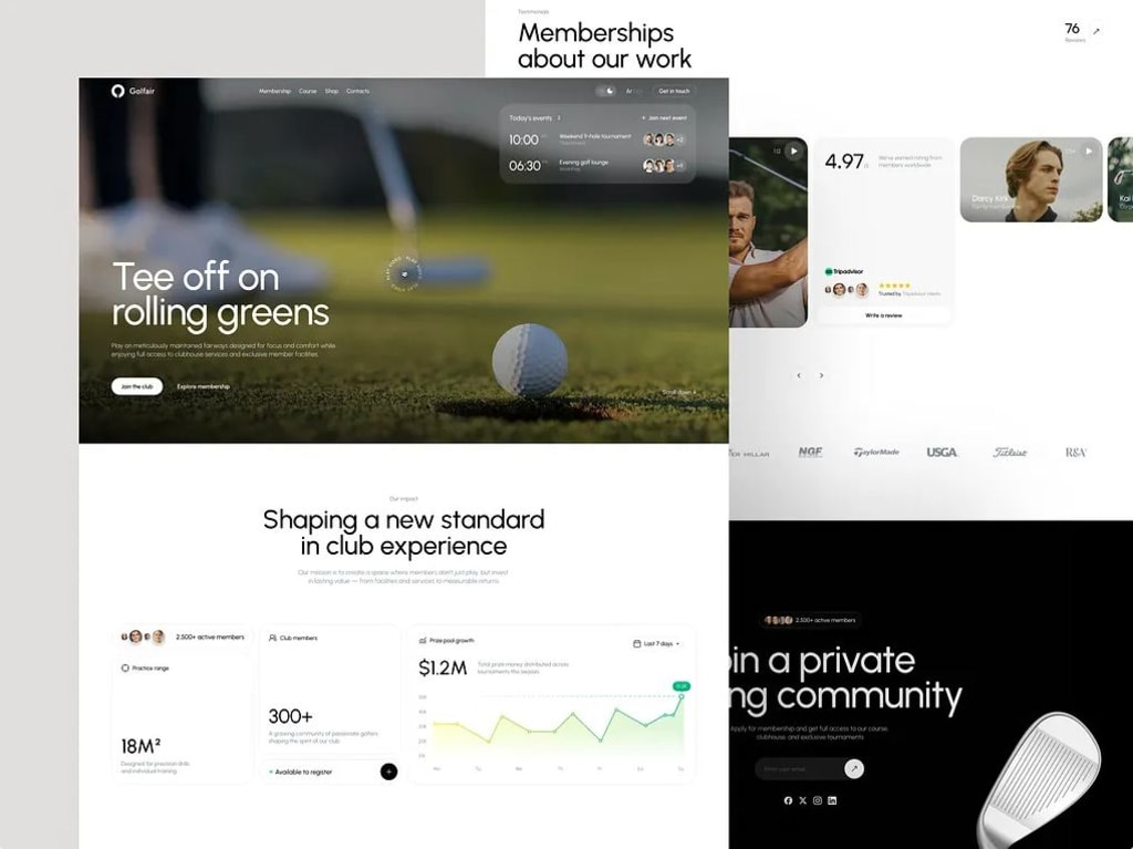
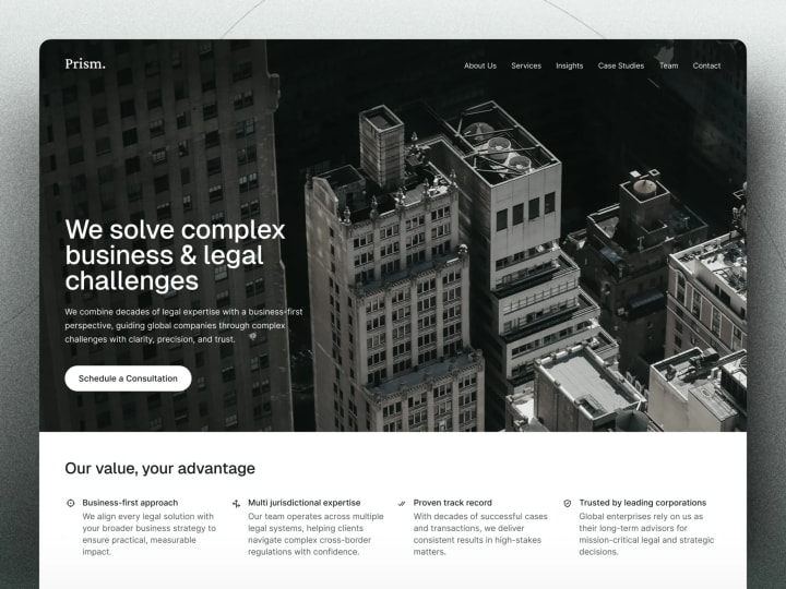
Users don’t read websites—they scan them. If they can’t instantly understand what you offer and why it matters to them within seconds, you’ve already missed your chance.
This means your headline must be direct and informative. Typography, spacing, and visual emphasis should all converge on a single focal point: your core value proposition. Ditch vague jargon like “innovative synergistic solutions.” Instead, say plainly: This is what we do. This is who it’s for. This is why it matters to you.
From my experience, the pages that convert best often feel almost too straightforward—because their priority is clarity, not cleverness.
Intent-Driven Page Architecture
Every page has a purpose—and that purpose should dictate its structure. A homepage isn’t a pricing page. A detailed feature breakdown shouldn’t mimic a sign-up funnel. Yet many websites treat all pages as if they’re just skins on the same generic template.
Conversion-oriented design begins with a simple question: What should the user accomplish here?
- On a landing page? Grasp and believe in your offering.
- On a pricing page? Evaluate options and make a choice.
- On checkout? Complete the action with confidence and peace of mind.
Each objective requires its own layout rhythm, content flow, and emotional tone. You wouldn’t hang a photo with a sledgehammer—and you shouldn’t use a blog-style format for a high-stakes SaaS trial signup. Align structure with intent, and conversions naturally follow.
Friction Elimination by Default
Every extra decision introduces a potential exit point. Do users need an account just to view pricing? Must they scroll through three auto-rotating banners to find a form? Is it obvious what happens after clicking “Get Started”?
Effective CRO-driven design anticipates and removes these micro-barriers before they arise. It minimizes cognitive load by limiting unnecessary choices—even if marketing insists on 12 call-to-action buttons. It places trust indicators where doubts are most likely to surface and reveals information progressively, only when needed.
The ultimate aim? Make the desired action feel intuitive, effortless, and secure.
Why A/B Tests Often Miss the Mark Without Solid Design
As mentioned earlier, most A/B tests underperform because they attempt to measure cause-and-effect within a fundamentally flawed system.
If a page confuses visitors, contradicts their expectations, or feels cobbled together without coherence, no button shade will save it. In such cases, testing adds noise rather than insight—obscuring signals instead of clarifying them.
Tinkering with Surface-Level Details While Ignoring Core Issues
Occasionally, changing a button color yields results—but only after the foundational elements are solid: Does the user understand what the button does? Do they trust the next step? Is this even the right moment for that action?
If any of those answers are “no,” you’re not optimizing—you’re just moving chairs around in a room with no exit.
True CRO design hinges on clear cause-and-effect relationships. When the underlying structure is weak, you lose the ability to isolate what truly drives behavior. Was it the green button—or was it the clearer headline above it in the same variant that finally made the offer click? Without a strong foundation, you’ll never know.
When CRO Data Turns Into Meaningless Noise
Have you ever run a test where both versions performed nearly identically, leaving you with no useful takeaway? That’s low-signal experimentation.
It occurs when you test changes that don’t address real psychological barriers—like minor wording edits on an already confusing page or slight layout adjustments on a user flow that’s misaligned with actual intent. The result? Wasted time and effort.
Even worse, these tests breed false confidence. Teams proudly declare, “We tested it!” as though activity equals progress. But if your experiment doesn’t confront genuine obstacles—like trust deficits, mental overload, or mismatched expectations—the data you gather is just statistical background noise.
So before asking, “What should we test?” ask instead, “What’s actually preventing people from converting?” More often than not, the answer lies not in your color scheme but in the architecture of your design itself.

When A/B Testing Actually Delivers Value
A/B testing should be the final polish—not the starting point.
Running multivariate experiments on a page where visitors can’t even figure out what you sell is a classic misuse of testing. Yet this is exactly what happens when teams treat A/B testing like a cure-all rather than a precise, late-stage tool.
Too often, companies waste months in so-called “growth sprints,” obsessing over button phrasing while their core message is buried under layers of corporate buzzwords. In reality, a straightforward redesign—guided by actual user behavior—would have driven ten times more impact.
So, when does A/B testing make sense? Only after you’ve done the unglamorous groundwork: when your messaging is crystal clear, your user experience aligns with real intent, and your data reveals consistent, interpretable patterns.
The CRO Readiness Progression
Effective conversion-focused web design follows a deliberate, step-by-step maturity path:
✅ 1. Solid Design Foundation
Is your layout intuitive? Does your headline instantly convey value? Does visual hierarchy steer attention to what matters most? If not, stop. No amount of testing will compensate for fundamental confusion.
✅ 2. Intentional UX Architecture
Are your user flows logical? Is friction designed out from the start? Do pages reflect how users actually think? This is where you fix structural flaws—like demanding payment before explaining benefits or hiding pricing behind a demo gate.
✅ 3. Behavior-Informed Insights
Now layer in analytics, session replays, and heatmaps to pinpoint why people drop off—not just where. Shift your question from “What should we test?” to “Why are users leaving at this exact moment?”
✅ 4. Strategic Testing
Only now does A/B testing become truly powerful. You’re no longer guessing—you’re validating hypotheses rooted in clear design, observed behavior, and real pain points. You’re fine-tuning a system that already works well.
In practice, this means:
- Test only after your core message has been validated with real users.
- Test only after your checkout flow performs reliably across mobile devices, slow connections, and late-night browsing.
- Test only after you’ve identified which metrics genuinely predict long-term retention.
The ultimate goal of CRO-driven design isn’t endless experimentation—it’s building a site so clear, trustworthy, and effortless that testing simply refines an already strong foundation.
How to Know If Your Site Is Ready for CRO Testing
Before launching another experiment, ask: Is my website actually optimized enough to benefit from testing?
Testing a flawed foundation doesn’t yield insights—it just quantifies dysfunction. More often than not, poor conversion stems not from insufficient testing but from failing basic conversion hygiene.
Use this no-nonsense checklist. If you can’t confidently answer “yes” to most items, pause your tests and fix the fundamentals first.
✅ Is your value proposition instantly understandable?
Could a visitor grasp what you offer—and why it matters to them—in under five seconds? Not vague fluff like “unlocking next-gen synergies,” but concrete clarity: “Cut payroll processing time by 10 hours a week with one-click approvals.”
If your headline needs decoding, you’re losing people before they scroll.
✅ Does each page have one clear primary action?
Every page should have a single purpose: the homepage explains and invites; pricing helps users decide; feature pages demonstrate relevance.
If you’re showing multiple competing CTAs—like “Start Free Trial,” “Book a Demo,” and “Download Guide”—without visual prioritization, you’re making visitors guess your intent.
✅ Do you build trust before asking for commitment?
You wouldn’t propose marriage on a first date—so don’t ask for a credit card before proving your worth.
Review your flow: Are you displaying testimonials, security badges, or real results before the signup form? In regulated industries like fintech or healthcare, this isn’t optional—it’s essential. Even in e-commerce, small cues like “free returns” near the CTA can dramatically reduce hesitation.
✅ Does your design guide—not distract?
Clutter increases cognitive load and kills conversions. Every extra button, animation, or sidebar element competes for attention.
Ask: Does this component help the user move forward, or does it just fill space? Great CRO design feels almost invisible—it quietly directs focus to what matters without shouting.
If you’re realizing your site stumbles on a couple of these points, that’s normal. Most do. But don’t respond by running more tests. Instead, clarify your message, streamline the journey, and establish trust early. Then—and only then—start testing.

Final Insight: CRO Is First and Foremost a Design Practice
Conversion Rate Optimization isn’t a bolt-on tactic—it’s a design discipline at its core.
You don’t tack on CRO at the end like decorative sprinkles on a dessert. Instead, it must be woven into every design choice, from headline structure to footer navigation. If your layout doesn’t actively guide users, clarify your offering, and build trust, even the most rigorous A/B testing won’t rescue you.
Too many teams spend months chasing marginal gains—like a 3% uplift—while their homepage still leaves visitors scratching their heads, thinking, “Wait, what exactly do they offer?” That’s not optimization; it’s fiddling with furniture while the hull is taking on water.
Build Strong Design First—Then Optimize
Here’s the proven sequence for effective, conversion-driven web design:
- Lay a solid foundation: Ensure your value is unmistakable, your page intent is focused, and your messaging is authentic.
- Design out friction: Anticipate and eliminate unnecessary steps, distractions, or confusion before users encounter them.
- Earn trust early: Especially in high-stakes sectors like finance or health, establish credibility before asking for any commitment.
Only then begin testing. Remember: testing magnifies what already exists. If your design is clear, cohesive, and user-centered, experiments will fine-tune and accelerate performance. But if the foundation is shaky, testing won’t fix it—it’ll just highlight the flaws more clearly.
About the Creator
Shakuro
We are a web and mobile design and development agency. Making websites and apps, creating brand identities, and launching startups.


Comments
There are no comments for this story
Be the first to respond and start the conversation.