
How Web Design Impacts Page Speed and Core Web Vitals
Find out how web design strategies impact important metrics such as conversions, speed, and performance.


Many exquisitely crafted landing pages still fall short of expectations—even when they boast stunning visuals, persuasive copy, or flawlessly chosen call-to-action button hues. You might puzzle over why, but the culprit is often straightforward: page load speed.
No matter how visually impressive your site is, if it loads slowly or stutters when users interact with it, visitors will leave in a flash. Performance isn’t just a developer’s concern—it’s woven into every aspect of design, from image selection and layout architecture to mobile navigation patterns. Moreover, it directly influences Google’s Core Web Vitals, which have evolved beyond mere SEO technicalities into tangible indicators of real user dissatisfaction.
The good news? You don’t need to master front-end engineering overnight. Simply grasping how your design decisions affect loading times, user experience, and ultimately, business outcomes can make a meaningful difference—and it only takes a few minutes.
Stay with me. I’ll break down what truly drives web performance in design, separate fact from hype, and show you how to collaborate effectively with both your design and development teams—ensuring better results without derailing your next big product launch.
What Core Web Vitals Really Measure (Explained Simply)
Core Web Vitals are Google’s method of gauging how your website actually feels to real users—not just how it looks on paper or in a developer’s console.
You don’t need a tech background to understand them. If you’ve ever tapped a button on your phone and nothing happened, or tried to read something only for the page to unexpectedly shift because an image finally loaded, you’ve personally felt the impact of poor Core Web Vitals.
LCP – When Users See What Matters Most
Largest Contentful Paint (LCP) boils down to one question: “When does the main content appear?”
That could be your headline, a key product photo, or a registration form—whatever’s most prominent above the fold. Google tracks how fast that essential element loads. If visitors are stuck staring at a blank screen or a loading spinner for over 2.5 seconds, they’ll likely assume your site is broken—and many will simply leave.
INP – How Instantly Your Site Responds
Google replaced the older FID metric with Interaction to Next Paint (INP) because it gives a fuller picture of responsiveness. In plain terms: “When I click or tap something, does it react immediately?”
Imagine tapping “Add to Cart” and waiting half a second—or worse, watching the whole page freeze. That delay doesn’t just feel sluggish; it erodes trust. And most users won’t stick around to see if it recovers.
This problem is especially pronounced on mid-range devices, which make up the majority of user traffic—particularly outside big urban centers.
CLS – Whether the Page Stays Put While Loading
Cumulative Layout Shift (CLS) sounds complex, but it’s really about stability. Does your page jump around as it loads?
Picture this: you’re about to click “Download Guide,” but right then, a late-loading ad pushes the button downward. You accidentally tap the ad instead, get redirected to a questionable site, and now you’re frustrated. That’s exactly what a high CLS score looks like—and it can seriously hurt conversions.
Bottom line: these aren’t just technical checkboxes for SEO. Core Web Vitals directly influence whether people stay, engage, or bounce before even seeing your message. For any business, that’s not just a user experience issue—it’s a revenue issue.
How Design Choices Sabotage Core Web Vitals
Many Core Web Vitals problems are born long before a single line of code is written—in design tools like Figma.
We’ve all seen it: a designer presents a breathtaking mockup featuring a full-screen video background, silky scroll effects, and an animated carousel meant to “tell the brand story.” It wows in a pitch deck. But once it goes live—especially on a shaky 4G connection or an older smartphone—the experience falls apart. Suddenly, developers get blamed for “poor performance,” even though they were handed a vision that prioritized flair over function from the start.
Optimizing page speed begins with design. Every visual element and interaction you choose upfront directly affects performance. Without early collaboration between designers and engineers on realistic trade-offs, you’re effectively sacrificing user experience—and revenue—for aesthetics.
Overloaded Visuals and Excessive Flourishes
That cinematic hero video might scream “premium,” but it can tack on 5–10 MB of unnecessary data before your main message even appears. Similarly, ultra-high-resolution images that aren’t compressed or delivered in modern formats like WebP slow things down dramatically. And those “polished” entrance animations? They often hog the browser’s main thread, pushing back when users can actually interact with the page.
Layout Shifts Stemming from Design Oversights
Ever had text suddenly drop down the screen because a custom font finally loaded? Or clicked a button only for it to vanish as an ad resizes? These jarring shifts are classic signs of poor Cumulative Layout Shift (CLS)—and they’re almost always rooted in design decisions.
Designers frequently call for trendy fonts like “Clash Grotesk” or “Inter” without specifying fallbacks or considering how they’ll load. Developers can help minimize the impact—but only if performance is treated as a shared priority. The same goes for dynamic UI elements: sticky headers, auto-expanding sections, or testimonials that load late all need reserved space in the layout ahead of time. Without that foresight, the page jerks around like a bus slamming on its brakes.
UX Add-Ons That Bloat JavaScript
Carousels, exit-intent modals, embedded scheduling widgets, and real-time social proof tickers may seem like minor enhancements. In reality, each drags in third-party scripts that consume processing power, delay responsiveness, and inflate Interaction to Next Paint (INP) scores.
Worse, these features are often tacked on late in the project—as marketing “quick fixes”—after the core site is already built. But layering multiple tracking or engagement scripts onto one page creates bottlenecks, as they compete for limited resources and cripple interactivity.
This doesn’t mean high-performance websites have to be dull. You can absolutely deliver rich, compelling experiences without compromising speed. The key is for designers to consistently ask, “How will this affect loading time and responsiveness?” just as developers ask, “How will this run on a budget device?”
Because no matter how stunning your site looks, if it feels slow or unstable, users won’t stick around—they’ll go somewhere that simply works.
Performance-First Web Design Principles
Embrace Progressive Loading
Don’t hold back the entire page until every asset is ready. Ask yourself: What’s the bare minimum a visitor needs to confirm they’ve landed in the right place?
That core content—typically a headline, primary call to action, and perhaps one key visual—should load immediately. Everything else (animations, testimonials, secondary navigation, and decorative gradients) can follow afterward.
In performance-conscious design, this means planning for “skeleton screens” or low-fidelity placeholders. Think blurred image previews or neutral gray blocks that smoothly transition into final content. This approach feels faster because users receive instant feedback: “The page is loading—something’s happening.”
If your hero section depends on a 3MB background image, challenge its necessity. Does it truly enhance understanding or conversion—or is it just eye candy? Often, a solid color or soft gradient conveys the same tone with a fraction of the file size.
Minimize Visual and Interactive Overhead
More layers don’t equal a better user experience. Every hover effect, animated dropdown, or micro-interaction adds both cognitive strain and technical complexity.
Streamline your visual hierarchy. Rely on contrast, whitespace, and thoughtful typography to direct attention—not parallax scrolling, floating buttons, or cursor-chasing elements. Fewer moving parts mean fewer opportunities for delays, layout shifts, or user confusion.
Take, for instance, a header packed with a mega-menu, nested flyouts, live stats, and an embedded search bar. It may look feature-rich on desktop, but on mobile, it could take over two seconds just to open—if it works at all. Simplifying such components isn’t a compromise; it’s essential for boosting conversions.
Design for Real-World Conditions
“Mobile-first” shouldn’t just mean responsive layouts—it should mean designing for a $200 Android device on an unreliable 3G connection in a busy café. That’s the reality for a significant portion of your audience, even if your team works on top-tier MacBooks with gigabit internet.
When optimizing for speed through design, test your concepts under actual constraints. Use browser throttling tools, but go further: pick up an older smartphone, disable Wi-Fi, and try completing your key user flow. Can you read the main message? Tap the button without delay? Submit a form without frustration? If not, revisit your choices. Maybe that custom font isn’t worth the layout shift. Maybe that auto-playing testimonial video should be replaced with a static quote and an optional play button.
Performance-driven design is rooted in empathy—respecting your users’ time, attention spans, and hardware limitations. When this mindset becomes part of your creative process, speed transforms from a developer’s burden into a strategic edge.
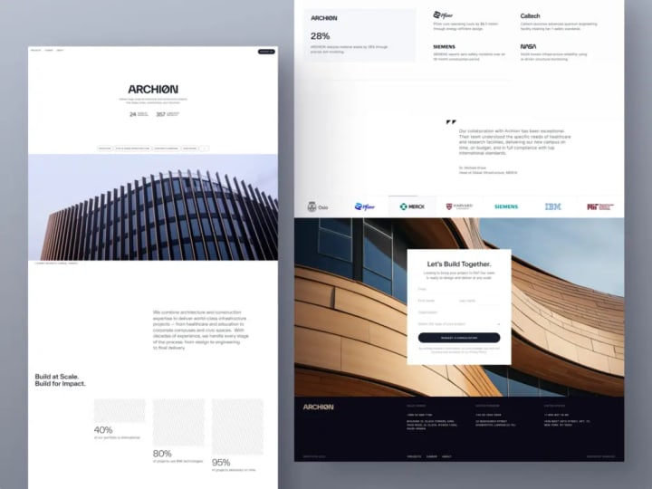
For example, consider the Proko project from the Shakuro portfolio—an online art education platform with both web and mobile interfaces. Its users are often students with limited time and modest devices. Recognizing this, we prioritized speed and clarity in the layout, resulting in lightweight, intuitive experiences across both platforms that load quickly and work reliably—even on older hardware.
Design Pitfalls That Undermine Web Performance
Prioritizing Aesthetics Over Actual Use
It’s easy to get swept up in Dribbble-worthy designs: buttons that elegantly morph into spinners, cards that bounce in with physics-based flair, or cinematic full-page transitions. They look incredible, rack up likes, and inspire other designers—but they rarely help users achieve their goals. In fact, they often slow things down or add unnecessary friction.
User-centered design starts with a simple question: Does this element help someone understand, decide, or act more quickly? If the answer is no, it’s not an enhancement—it’s just visual noise.
Overlooking Real Mobile Realities
Calling a layout “mobile-responsive” doesn’t mean simply shrinking a desktop design. Yet too many teams treat mobile as an afterthought—using the same heavy assets, complex interactions, and dense UIs, just scaled down.
But mobile isn’t just about screen size. It involves slower processors, inconsistent network connections, limited battery life, and imprecise touch inputs instead of fine-tuned mouse pointers. That 4MB hero image might load instantly on your high-speed office connection, but for someone on a shaky rural connection, it could mean six seconds of staring at a blank screen.
And it’s not just about loading—it’s about interaction. When tap targets are crammed too close together, users end up accidentally opening a chat widget instead of submitting a form. That’s not a user error; it’s a design flaw.
True mobile-first thinking means making deliberate trade-offs: cleaner layouts, system fonts instead of custom ones (to avoid layout shifts), and static visuals over auto-playing videos. These choices aren’t compromises—they’re commitments to usability, which directly influence conversion rates.
Assuming Speed Can Be “Fixed Later”
Phrases like “We’ll optimize performance after launch” or “Let’s ship now and speed it up later” sound practical—but they’re dangerously misleading.
By the time a site goes live, its structure is locked in. Heavy images, bloated animations, and third-party scripts are already woven into the fabric of the experience. Asking developers to “retrofit” performance into a design that was never built with speed in mind is like asking them to rebuild the foundation of a house after the roof is on.
Performance isn’t a polish step—it’s a core constraint, as fundamental as brand guidelines or tone of voice. Top-performing teams treat it as non-negotiable from day one. No component gets approved unless it meets baseline thresholds for LCP (loading) and INP (responsiveness). No animation ships if it blocks user interaction.
At the end of the day, users don’t care how much effort went into your intricate gradient mesh or parallax scroll. They only care whether the page works—smoothly and immediately. If it doesn’t, they’ll assume your entire product is unreliable.
It’s tough to realize that some of our most “impressive” designs may have been hurting performance all along. But that awareness is the first step toward creating work that’s not just beautiful but truly effective.
Striking the Right Balance Between Visual Appeal and Performance
When High-Impact Visuals Make Sense
There are rare, strategic moments where investing in richer media is justified—like a major product reveal for a luxury brand or a creative studio launching a signature campaign. In these cases, the visual experience is the message. A thoughtfully optimized video backdrop, a distinctive custom font, or a subtle scroll-driven story can deepen emotional engagement and reinforce brand prestige.
But this only pays off if three conditions are met:
- Intentionality—The element serves a clear purpose beyond “looking cool.”
- Optimization—It’s compressed, lazy-loaded, and delivered in modern formats (like WebP or AVIF).
- Non-blocking behavior—Core interactions (like a primary CTA) remain fast and usable, even if decorative assets load later.
Our approach treats rich media like stage lighting: used sparingly and only where it truly enhances the narrative. The rest of the site stays lightweight, ensuring that one standout moment shines without compromising overall performance.
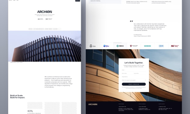
Take the Mirko Romanelli website we designed as an example. As a minimalist industrial and product designer, Mirko’s work demands a visually compelling showcase—complete with refined animations, elegant transitions, and immersive visuals. Yet, because first impressions are critical, the site had to run flawlessly. The result? A seamless fusion of aesthetic sophistication and technical efficiency—where beauty never comes at the cost of responsiveness.
When Speed Takes Priority
Now consider the opposite scenario: your page exists to drive actions—sign-ups, demo requests, or e-commerce purchases. Here, performance isn’t just nice to have; it’s mission-critical.
In task-focused contexts, users aren’t browsing for inspiration—they’re trying to complete something. Every extra millisecond, every unexpected layout shift, and every delayed response chips away at their patience and trust.
Ask yourself:
- Is the user in a high-intent, goal-driven flow? → Speed wins.
- Are they likely on mobile or a budget device? → Speed wins.
- Does this page directly impact revenue (e.g., pricing, checkout, trial signup)? → Speed wins.
Even tiny delays add up. A 200 ms lag on a “Start Free Trial” button might seem insignificant—but across thousands of visitors, it can silently sabotage dozens of potential conversions.
A Practical Decision Framework
Before greenlighting any visual element, apply this quick checklist:
- Does it directly support the main user action on this page?
- Can we achieve a similar effect with a lighter alternative? (e.g., a CSS gradient instead of a background image)
- What’s our performance budget for this section?
Achieving great page speed in web design doesn’t require sacrificing creativity—it requires alignment. When designers, developers, and product teams share a common understanding of priorities, they can collaboratively decide which elements deserve extra attention and which can be simplified or delegated. It’s not about control—it’s about clarity, collaboration, and knowing when to lean into beauty versus when to prioritize function.
Final Thought: Performance Is a Core UX Choice
Fast websites don’t just load quickly—they convert better, by design.
There’s no magic SEO hack or backend shortcut that guarantees great page speed. Real performance stems from user experience. When a page loads instantly, visitors stay. When interactions respond immediately, trust builds. When the layout stays stable and nothing jitters or freezes, users feel confident taking action. In business terms, that’s the difference between a high-converting landing page and one that quietly leaks leads.
Yet too many teams relegate performance to a post-launch “tech debt” item—something developers will “optimize later.” But by then, it’s often too late. High bounce rates are already baked in. Missed sign-ups can’t be recovered. And your brand may already feel sluggish or unreliable in users’ minds.
The truth is, performance begins with design. Every image selected, every animation greenlit, and every layout finalized contributes to either a seamless experience or hidden friction. Users sense this before they even finish reading your headline.
If growth is your goal, stop treating speed as a developer’s afterthought or a minor ticket in a backlog. Start treating it as a foundational pillar of your product strategy. Because the surest way to drive more demos, more conversions, and more revenue is to build a site that works—smoothly, instantly, and reliably—the moment someone arrives.
About the Creator
Shakuro
We are a web and mobile design and development agency. Making websites and apps, creating brand identities, and launching startups.
The Role of Strategic Communication in Business Success: Aligning Vision, Culture, and Execution
Strategic communication is one of the most powerful yet often overlooked drivers of business success. While companies invest heavily in strategy development, technology, and talent acquisition, the ability to clearly communicate vision, priorities, and expectations ultimately determines whether those investments translate into meaningful results. When communication is intentional and aligned with business goals, it connects leadership vision to daily execution, strengthens organizational culture, and improves overall performance.
By Warren Ferster2 days ago in 01


Comments
There are no comments for this story
Be the first to respond and start the conversation.